 I've
I've been using Android since Cupcake and I've both seen and used a lot of launchers sinc
e then, some impressive (Nova Launcher) and some not so impressive. The biggest complaint I have with other launchers is that they really don't do anything that the default Android launcher doesn't already do! They give you a series of identical (or nearly-identical) screens that can be layered with icons, widgets and what-nots, you have an app drawer at the bottom... in the latest Jelly Bean versions (I've been running 4.3 on my Verizon Galaxy Nexus and my US Cellular Moto X), you will typically see five icons at the bottom with things like dialer, contacts, browser, messaging or camera... and in the middle you'll see the app drawer that when tapped on will by default show your all of your apps in the "Apps" category. If you scroll all the way past your final page of your apps OR you tap on the "Widgets" category, you are then presented with the available widgets you can add to your home screens and/or lock screen. While this set-up is a huge improvement on what Gingerbread and Honeycomb used to offer, this arrangement is what you'll find on nearly all of the launchers: the default launcher, Nova Launcher, GoLaunher, Trebuchet, Apex, ADW, LauncherPro... I've used all of those and they all felt the same! Sure, some launchers like CircleLauncher try to do things different, but in my opinion they are TOO different and the learning curve takes a really long time to get used to compared to what most Android users are accustomed to... you really have to force yourself to constantly use it and learn the ins and outs of it that it becomes more of a chore and less of a tool to make things easier, or simpler. Why would you even need a mostly gesture based UI? There really isn't any need for it with touchscreens, PERIOD.


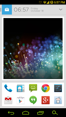
This is the typical app drawer that most users see every day with their Android phones
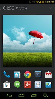
The first thing you will notice with Aviate that takes inspiration from the classic Android launcher screens that can be changed with the slide of your finger, but here is where it is different... There are four screens, the one you are on is your "home screen". It displays the time, day of the week and date, picture of your choice and 10 of your "favorite" apps, by default these are set by what I assume are the most used apps that you have opened on your device as G+, Hangouts, and Reddit is Fun were already on my list. If you scroll over to the screen to the right it will provide you with location options (mine is based off my Foursquare activity, yes, I still use it!) that gives you Work, Night, Morning, and Home options plus of course the best guessed location that it tries to predict you are at... this works most of the time (as of the Oct 22nd update), and option to share your current home screen to your favorite social network (G+ is the best one though... so if you're using something else...)
As you can see, the ability to change between light and dark themes can make the experience easier on the eyes.
This is one thing that I absolutely love as an avid Foursquare user... automatic
integration into the app allowing easy check-ins? Yes!
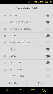
For those who do not use Foursquare, there are also a lot of cool "Locations" that you can pick from and the cool thing about "Home" Work", "Morning", "Night", "Going Somewhere", and "Settings" is that for each one that you pick, you will be provided with some apps that might be important or useful for you depending the time of day, location, or even your mood. For example, when I pick "Work" I get presented with apps such as Calendar, Google Drive, Calculator, Chrome and other apps that can be useful in the Workplace. If you pick "Morning" for example, it will offer you the weather, Chrome, RSS apps, Alarm Clock (gotta hit snooze!), and so-on. I like that it has these different categories that can be chosen, but this is not all. From the "main" screen, when you scroll over the first page to the right, you will see the "Collections" screen in-which Aviate will try to categorize your apps in their respective areas... "Social", of course includes everything from Google+, Facebook, Instagram, and even your Camera app, while "Night Time" will give you Netflix, the Torch (or Flashlight app), etc... and it continues much like that, BUT if these don't fill your needs, you can add additional apps to each category and customize it to your heart's desire. Now, what if you want more categories? Hit the settings icon in the top right corner and choose which ones you want to be visible or hidden, it is literally all up to you. When you swipe to the furthest right screen, you are shown all of your apps in alphabetical order and quite frankly I like this much better than the old app drawer and there really isn't much to describe in how that works.
"Now J, where are my widgets??". I admit that widgets don't work perfectly in Aviate as they do in every other launcher and the change was a little hard to get used to for me, but do not fret there is an alternative. Press your Home button and it'll whirl you back to the main screen and to add widgets, press and hold on the photo and you'll see the option to change/remove the photo, but you can also ADD another photo at the top left and add a widget on the top right... I do not like how there is a delay for your widgets (depending on how many you have, I have nearly 600+ to choose from on my current Galaxy Nexus setup) and choose your widget. This is where I have a really big problem: widgets don't yet size the way they are suppose to... sure, there are some widgets that will be PERFECT, but I think it's sad that if I can to add the default Calculator on my phone gets all smooshed and squished up... don't like it at all, but that is probably another reason that Aviate is still in the Invite Only Beta and I hope they will fix widget implementation very soon because it is driving me NUTZ (with a Z!)
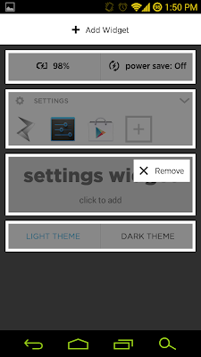
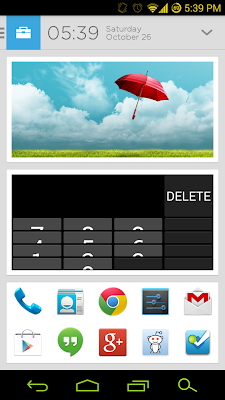
On left is the previous way of adding a widget, but now it is easier to add a a widget
or an extra picture. Unfortunately, adding widgets is useless with the current version.
More of what is on the left and less of what is on the right.
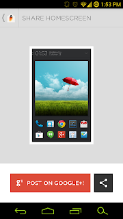
OF course, even with these few flaws I still love this launcher and while it may not be perfect, it is doing something right because instead of retreading what other launchers have been doing for years, Aviate is doing something different and it is getting noticed. I don't really like the whole Invite Only Beta because I feel it creates a false sense of want and desire because it makes people feel like they NEED it, but of course it is what Google has been doing since GMail, Google+, Ingress and loads of other products (Google Buzz... still burned by that!). What do I want Aviate to do? Other than getting it to better handle adding widgets, I don't want to see a "loading screen" when going back to home after spending 40 minutes on YouTube or Reddit. I would also like to see possibly more theming options but I'm happy with what we already get if it means the app is more stable but of course that is just dreaming. Really Aviate is shaping up to be the best launcher I've used (so far), but with the few bugs and lack of design choices it is more functional than pretty. If you want a launcher that can sort your apps better with a simple and cumbersome-free design, you really can't go wrong with this plus I really love the fact that you can easily share your homescreen with your friends and followers on social networks (Google+ love!)
 Want an invite? Just let me know in the comments!
 Follow me on Google+ for further updates.


